Social Network B-Gone. Some basic CSS to clean the angular theme.
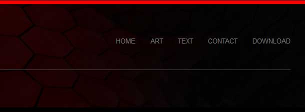
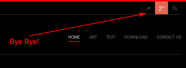
I've made the decision to eject all social network outbound links to appear on every page of my website. This took some doing as I had to page through a lot of the Angular theme forums to ultimately find out Which CSS code controlled the very top section of my page. I had to modify my custom.css file which was found in the theme home directory underneath ./css and added the following lines.
Note 9/9/2016: I should let everyone know that this blog is dated. These instructions are for CSS code modification for the Angular theme by Krisei . We have since moved on to other themes and no longer use this theme.
.social_bookmarks .rss {

display: none;

}
body.home .social_container {

display: none;

}
.social_container.extralight-border {
display: none;
}
Add these lines to the custom.css in your /themes/angular/css/ folder. 
After adding those lines all of the feeds including the RSS feed which cannot be edited out of angular normally is all gone. Since the RSS feed is no longer at the top I can simply place it in the footer as a Ad-Icon. It's all clean at the top. And I suppose the disadvantage of removing social network from my site is that I will lose some traffic. Which I did! But it was all spammer traffic so no real loss and I get to see the actual number of people visiting versus the inflated crap number.
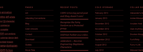
Another thing I did as well is I cleaned up the footer some more by reducing the columns to 3 by removing all plugins dealing with twitter.
About social networks.
Social networking is a two way street if you think about it. And with every damn site linking to twitter or google in some way shape or form no wonder why those services end up becoming number one while the rest of the media out there scratches their heads wondering what they did wrong. Social Networks are not a bad thing, but occasionally you have to put them in their place. Also, after consolidating all of the various Q&A into a FAQ section of the site resulted in a lot of cleanup that went surprisingly well. On many of the screen configurations I barely had to scroll the mouse around from page to page to get all of the content. It is simply there.
Wrapping H1 tags around the logo of a website.
 This is what Bing reports with a default angular theme
Google and Bing does not like too many H1 tags floating around. It effects your SEO score. A logo to a search engine is nowhere near as important as the initial title of a page. And the user will not see if a logo is H1 or H2 anyways. This is where you have to dig deep into the Angular theme to change this. In the following directory of your wordpress: /wp-content/themes/angular/framework/php/function-set-avia-frontend.php line 482 original code is as follows:
function avia_logo($use_image = "", $sub = "", $headline_type = "h1", $dimension = "")
change the $headline_type = "h1" to $headline_type = "paragraph"
function avia_logo($use_image = "", $sub = "", $headline_type = "paragraph", $dimension = "")
And save the file. You may have to clear your browsers cache so Bing can get a new snapshot of your site. But you will notice at the very least the H1 tags are now gone from your Images. Finally, because my blog entries generate H1 titles naturally I have to stop my blog pages from automatically inserting an H1 title stating that "This is a blog". in the functions.php file.
echo '<h3 class="page-title heading-color">'.$title.'</h3>';
edit: I found out later that placing it in h3 class doesn't work for mobile browsing. Another thing I did to stop warning messages for the directory of blogs I have is to simply reduce the title to h2 as well. For this I went into /angular/includes/format-standard.php and edited the following:
            <h2 class='post-title offset-by-one'>
                    <a href="<?php echo get_permalink() ?>" rel="bookmark" title="<?php _e('Permanent Link:','avia_framework')?> <?php the_title(); ?>"><?php the_title(); ?></a>
            </h2>
This will make the blog entries H2 and the primary blog title H1 which SEO's then like the structure of your site for labeling blogs in such a fashion. And now SEO is happy once again.
More stupid footer tricks.
 The last entry talked about simply cleaning up the footer. Now there was a discovery that the footer was loosing SEO points because the fonts were too small in a mobile environment. That apparently the font size is way too small for certain mobile phones to push. While on the Iphone this problem was never experienced upon trying out some android phones especially the piss poor Chinese knockoff ones with the bad touchscreens it became apparent. Once again going into the ./css folder of your theme and choosing custom.css I added these two lines to correct it.
.comment_page_nav_links{
font-size:14px;
}

.recentcomments, .widget_recent_entries li{
font-size: 14px;
}

#footer{
font-size:14px;
}
When trying to just modify the #footer alone which all properties should be inherited from it did nothing in the angular theme. It's a little asinine to define a font role in your layout.css but then totally ignore it in the widget entries. But after a while of digging my site is now %100 mobile friendly.
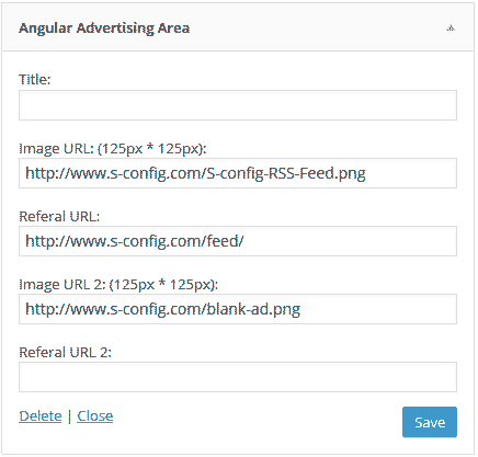
The Angular Advertising Area Widget is useless!
 It may seem harsh to say but the Angular Advertising Area Widget is a little useless in the notion that it does not allow for "alt" image descriptions. By using this plugin you destroy SEO as you are not defining what your images are in plain text format. So to do the same exact thing except actually be SEO freindly. Just use a genetic "Text" Widget in wordpress and insert some HTML code like the following.
<a href="/feed/"> <img src="/blah/blah/feed.png" alt="RSS Feed of S-Config" style="width:100px;height:100px"> </a>
More blog entries and information coming soon! In the meantime, thanks for checking out my site.
WordPress Media Element Player gives 0px height video:
For some reason the Angular theme really hates the default MediaElementPlayer that is the default-player for many WordPress Engines. It always sizes the images to 0px height making them partially break the CSS on the page as well as making the video to be viewed unseen. To correct this issue I had to go into /themes/angular/js/mediaelement/mediaelementplayer.css and edit the following: old code:
.mejs-container {
    position: absolute;
    background: #000;
    font-family: Helvetica, Arial;
    text-align: left;
    vertical-align: top;
    width: 100% !important;
    height: 100% !important;
}
new code:
.mejs-container {
    position: absolute;
    background: #000;
    font-family: Helvetica, Arial;
    text-align: left;
    vertical-align: top;
    width: 100% !important;
    height: 100%;
}
Removing the "!important" off of height seemed to fix the video issue in the Angular theme and i tested it with all browsers just to be sure. It kind of sucks that this has to be changed at the mediaelementplayer.css instead of default custom.css like everything else. It doesn't seem to work with IOS safari all the way, but people can still click on the video icon and it will take them to a full-screen of that. I would love to know how to fix that if anyone has any ideas.
Removing related posts to web cleanup additional blog entries.
 Another feature that was removed from this site was the "related posts" segment at the near footer of this site. It was removed because Google search engines were having a difficult time indexing each of my pages properly, stating that one image that had a %5 meta-tag relevancy is exactly the same as the image with the posting on it. Although this site is not the most kid friendly site in the world (and it never will be.) This site wants to try and keep things honest between linkage and will control manually what is relevant and what is not. If you have a angular theme and want to modify this go into the /theme/angular/single.php and modify the following on line 61:
get_template_part( 'includes/related-posts');
comment it out:
//get_template_part( 'includes/related-posts');
and save. Related posts will be gone after this point. - S

