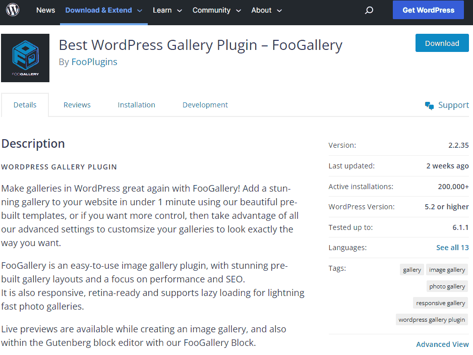
It's time to say goodbye to FooGallery.
We know it's a little back and to back to be talking about this plugin again after we simply turned off the Videos in our previous blog. But to keep things short and sweet for everyone reading quickly here. This blog has not disabled a beautiful, but expensive both in cost and bandwidth plugin in WordPress. That we're not stopping with just video. We're ripping it all out:
- FooGallery
- Foobox
Read on if you wish to continue with more web-admin diatribes.
WordPress and the pitfalls thereof.
A lot of people get into the bandwagon mindset that WordPress is slow and clunky. If you start to analyze what is really going on behind the scenes of a lot of websites that use WordPress. It's not the CMS that's the problem. It's the plugin ecosystem that WordPress lets run completely off of the rails that turns into the really real problem!

When you use a CMS as popular as WordPress. The plugin directory does not really go into technical details about the plugin such as the types of languages that are used, the payload of the scripts involved, and how much extra data it could potentially add to your site in terms of reload time. And finally, if a developer didn't feel like acquiring the rights to third-party data such as fonts or graphics and instead simply cartwheels your ass off to ANOTHER website that will slow you down even further. Nor does it give warnings or disclaimers about possible hostile interactions with other scripts and plugins such as optimization software both within your web daemon and/or another plugin. In a sad state of affairs, most WordPress admins are just thankful the damn thing works and is still being updated.
We paid the price for this long enough. Because when you dive into FooGalleries scripts in both CSS and javascript. an estimated uncompressed state this is how much every web user was getting blasted with:
- 350Kb of CSS code (where only 10 percent was legitimately used for your template and the rest is just extra space dying in the background.
- For Foobox almost 500Kb of Javascript code.
- For FooGallery Pro another 200Kb of Javascript code.
- 77Kb to 400Kb of FontAwesome libraries which although my WordPress theme partially uses it's another hazard going off to another dude's website.
C'mon S , that's under 1MB, you're making a big deal over nothing! - Anonymous
One meg of data may seem insignificant in the age of broadband. And it's even less after compression. However, when you have readers, and the world of internet spiders going through every page of your site. It adds up! Also, this site does not necessarily run on just the clear-net only with tor and especially I2P. Those two protocols don't necessarily run on the fastest thing on the planet due to the nature of the content distribution. Simply put, the tighter you can make your website code either via compression or simply ripping the bandaid off of your plugin directory like what we're doing will make a faster web for everyone.
Make my own CSS. And ONLY CSS.
Now good news everyone. this type of coding should work on things OTHER than WordPress. So if you're building a bare metal static site it should work okay as well. For those following along in WordPress, you should put your editor into 'text' mode instead of 'visual' so you can see the HTML code of your posting.
We have to say something about this. Which is it is incredibly hard to find people giving examples of doing ANYTHING in just CSS. It's like the entire world has this nervous tick to implement Javascript in places where it does not need to belong.
We're also going to make an attempt to reduce the amount of Javascript on this site to only dumb superficial things like the navigation system if you scroll up. So, as a test. we decided to use the Lainchan we brought in my cellar door as the guinea pig of our first experiment. Just a basic warning for
Simple Gallery mode:
So, let us make a responsive gallery. Here's the CSS part. This was based on the code from https://notabug.org/SylvieLorxu/CSSBox but of course, changed some things to my liking.
Simply Gallery for
/* Simple-Gallery CSS Action */

#simp-gallery {
 line-height:0;
 -webkit-column-count:8;
 -webkit-column-gap:5px;
 -moz-column-count:8;
 -moz-column-gap:5px;
 column-count:8;
 column-gap:5px;
 margin-top:2rem;
}

#simp-gallery img {
 width: 100% !important;
 height: auto !important;
 margin-bottom:5px;
}

#simp-gallery img:hover {
 filter:none;
}

@media (max-width: 1200px) {
 #simp-gallery {
  -moz-column-count: 6;
  -webkit-column-count: 6;
 column-count: 6;
 }
}
@media (max-width: 1000px) {
#simp-gallery {
-moz-column-count: 4;
-webkit-column-count: 4;
column-count: 4;
}
}
@media (max-width: 800px) {
 #simp-gallery {
  -moz-column-count: 3;
  -webkit-column-count: 3;
 column-count: 3;
}
}
@media (max-width: 400px) {
 #simp-gallery {
  -moz-column-count: 1;
  -webkit-column-count: 1;
  column-count: 1;
 }
}
Right on, Define some initial columns, and make sure the image stretches across the container of my theme. and finally, throw in some @media tags for the browser which may (or may not depending on browser security) tell the resolution, and resize accordingly.
add the following HTML
<div id="simp-gallery">

attach as many images as you want here.

</div>
If you want to see this in action on my site it's currently running the Lainchan webring in my cellar door section.
And that's it! Wow, not painful at all.
In this case of webring placement, this works out very well because it takes advantage of how much horizontal space it can work with on my cellar door page. The only thing that was a little odd is how it sorts my listing by column instead of row. But if that's the worst that happens and I got my code in 785bytes of size uncompressed we'll take it!
A more legit gallery.
Okay, so the gallery above is great for images with links but it's no foobox because it does not have cool transition fades AND there's no lightbox. So let's fix that shit as well. Again! CSS only because we can!
First, the gallery portion. But with more effects in IMG and more columns
/* Like before but with more columns */

#norm-gallery {
 line-height:0;
 -webkit-column-count:6;
 -webkit-column-gap:30px;
 -moz-column-count:6;
 -moz-column-gap:30px;
 column-count:6;
 column-gap:30px;
 margin-top:5rem;
}

/* filter transitions to give us a burnt red grayscale effect */

#norm-gallery img {
 width: 100% !important;
 height: auto !important;
 margin-bottom:20px;
 -webkit-filter: invert(40%) grayscale(100%) brightness(20%) sepia(100%) hue-rotate(-50deg) saturate(400%) contrast(2);
 filter: grayscale(100%) brightness(20%) sepia(100%) hue-rotate(-50deg) saturate(600%) contrast(0.8);
 transition: filter 500ms ease;
 -webkit-transition: -webkit-filter 500ms ease
 transition: all 0.2s;
 -webkit-transition: all 0.2s;
 -moz-transition: all 0.2s;
 border-radius: 25px;
}


/* some more responsive breakdowns, still fucking around with this. */

@media (max-width: 1200px) {
 #norm-gallery {
  -moz-column-count: 5;
  -webkit-column-count: 5;
 column-count: 5;
}
}
@media (max-width: 1000px) {
 #norm-gallery {
  -moz-column-count: 4;
  -webkit-column-count: 4;
  column-count: 4;
 }
}

@media (max-width: 800px) {
 #norm-gallery {
  -moz-column-count: 3;
  -webkit-column-count: 3;
  column-count: 3;
 }
}
@media (max-width: 500px) {
 #norm-gallery {
  -moz-column-count: 2;
  -webkit-column-count: 2;
  column-count: 2;
 }
}
@media (max-width: 300px) {
 #norm-gallery {
  -moz-column-count: 1;
  -webkit-column-count: 1;
  column-count: 1;
 }
}
Lightbox time.
Okay, because we're still working in a CMS theme it was a bit of a trip to find something that worked for our environment however the guys at webdevtrick had an example that worked out. I cut a lot out of their code because We didn't want forward/backward buttons and the exit button trapping users in the lightbox CSS has to go as well. Also, since it's working inside of my gallery CSS above. I have to add some "!important" and force the effects to stop when in lightbox mode otherwise the whole image goes into red greyscale on mobile devices due to how CSS can't sense the 'mouse over' on a touchpad.
Anyhow, here's that bit of code.
/* setup the environment so when the user clicks on a lightbox link it brings everything up front while dulling out the website */

.lightbox {
 position: fixed;
 z-index: 99999;
 height: 0;
 width: 0;
 text-align: center;
 top: 0;
 left: 0;
 background: rgba(0, 0, 0, 0.8);
 opacity: 0;
}

/*additional none filters enforced so that gallery does not apply to lightbox*/

.lightbox img {
 max-width: 100%;
 max-height: 100%;
 display: flex;
 align-items: center;
 justify-content: center;
 opacity: 0;
 filter: none;
 -webkit-filter: none;
 object-fit: scale-down;
 border-radius: 0px;
}

/*the importants i would traditionally set for "1" so the image does not move due to the gallery again. but up to you */

.lightbox img:hover {
 filter: none !important;
 transform: scale(0.95) !important;
 -webkit-transform: scale(0.95) !important;
 -moz-transform: scale(0.95) !important;
}

.lightbox:target {
 outline: none;
 width: 100%;
 height: 100%;
 opacity: 1 !important;
}

.lightbox:target img {
 filter: none !important;
 -webkit-filter: none !important;
 opacity: 1;
 webkit-transition: opacity 0.6s;
 transition: opacity 0.6s;
}
Party time. That's all there is for CSS.
Bringing it all together in HTML5 code.
<div id="norm-gallery">
 <a href="#img1"><img class="thumb" src="/img/date/yourthumbnailhere.jpg" /></a>
 <div id="img1" class="lightbox">
   <a href="#_"><img class="aligncenter size-full" src="/img/date/youractualimage.jpg" alt="This is my test image" /></a>
 </div>
</div>
Now, you don't really have to define a thumbnail if you feel your images are small enough. again, this is all up to you and how much you want to generate on the front end of your website to save users space. It's probably highly advised to make thumbnails if you're running a heavy photographic site hosting high-resolution files on it.

We have this deployed in multiple sections of our site from our color art section, sketches, and more.
Final thoughts.
For those wondering, we did e-mail our concerns of backward compatibility to Foobox and Foogallery support and got a very robotic response that they will get back to us in which after months of version updates. It's safe to say that it's not the path that they want to go down. We suppose the consolation prize to us coding out our own gallery and lightbox is that we only add what we need and throw out the rest. resulting in my style.css going from 422KB to just 77KB uncompressed.
On top of all of this, FooGallery was demanding to not use optimization tools on our website, or else it could potentially hurt their fragile javascript code. Almost every month we had to temporarily disable cache in order for Foogallery to get its shit together and behave within my website like a normal plugin. Well, we're done with that. Our CSS solution may not be the most bulletproof in the world. Hell, it probably will STILL piss off the old-web Netscape navigator crowd. But at least it works with my caching system and that's one less function i have to keep going.
You were pretty FooBox. But expensive and high maintenance. Goodbye.
Server protect you.
+++END OF LINE


